ShopDreamUp AI ArtDreamUp
Deviation Actions


Suggested Deviants


Suggested Collections


You Might Like…


Featured in Groups


Description
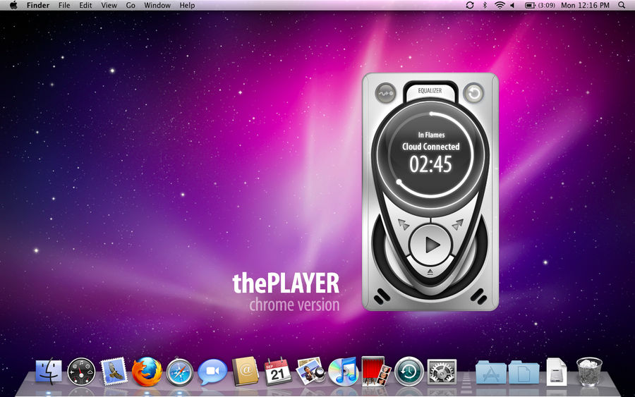
One of my mates asked if i can make a chrome version for thePlayer  (Smile)")
I think it's looking really nice this way
You can also find black and white versions here:
[link]
I think it's looking really nice this way
You can also find black and white versions here:
[link]
Image size
1280x800px 1.15 MB
Comments61
Join the community to add your comment. Already a deviant? Log In
This is a very nice design: It's nice and sleek, and very modern, not to mention that it is very simple in colors. While this is not something major, I would love to see this with optional colors, though not important. Also, another small thing, is that I feel that the Random/Repeat buttons and the Speak hole design should be swapped, to give it a little more balanced. Also, the circling line telling how far you are in the song- I think it would be interesting to have that fade at the beginning. Does this also have the expanding list like I saw in your other designs? If not, I think it would be implemented very well within this design, with the same grays used throughout. Also, is it possible to take the time for one song and have an option for those of us that like to see the amount of time for our playlist? I would love to see that, if possible.
All in all, it's a very nice piece, and you did a great job on it.